— This stands as a sketch for the future
We’ve just launched a website for Claim The Future, a project led by John McDonnell. The full text of his speech at the launch on Wednesday gives a good overview of the project:
We must claim the future. We have to ask and answer the questions about what lives we want to live, what communities we want to live in and what future there should be for our planet. If we don’t others will. And it will be the establishment politicians and their corporate controllers that will answer these questions for us.
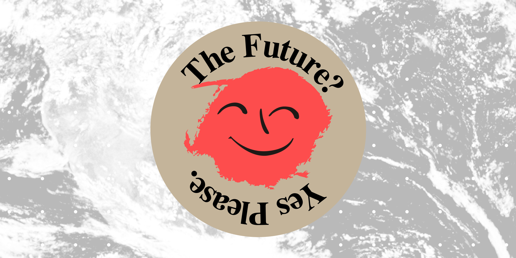
Both the identity and website were a joy to work on, so I thought I should document a little bit of the process before I forget about it.
Claim the Future aims to respond to the economic and political upheaval caused by the pandemic by uniting the left behind a radical and optimistic vision of the future.
The team have drafted a series of position papers that address a wide range of different areas, from healthcare to migrants’ rights. These position papers will form the basis on which to initiate a series of actions and campaigns.
What I like about the project is that it’s not just about theory, but practice as well. There’s a strong focus on building a movement and encouraging people to take action.
Like Progressive International, Claim the Future also aims to strengthen and amplify existing initiatives. It’s about uniting the left and taking a step forward, moving past defeat and critical reflection.
Background
The brief I was given for the identity design was super exciting in its ambition. They wanted something that felt determined, optimistic without being naively utopian, and communicated a clear break from the past.
RB and I had many discussions about the aesthetic of the radical left when designing the identity for Progressive International, and this project felt like a great opportunity to continue this inquiry further.
Given this was such an visually-led project, we got Michael Oswell involved as well. (Only the best!) I much prefer working with other designers than working alone – I always feel like the end product is better when there are a few different voices involved.
The visual references that John gave were Kandinsky and Social Realism – amusingly disparate ends of a spectrum. We needed to establish a visual language that communicated an optimistic vision of the future and inspired people to take action, without ignoring the harsh reality of the crisis.
I thought that Grapus was a really good reference for this project. Their work addresses political realities and sketches alternative visions of the future, in way that is visually appealing and accessible.
(Sidenote: I highly recommend What, You Don’t Know Grapus?. It gives a lot of insight into their process, the realities of being part a collective, and how different people can experience the same thing in entirely different ways.)
Developing the aesthetic
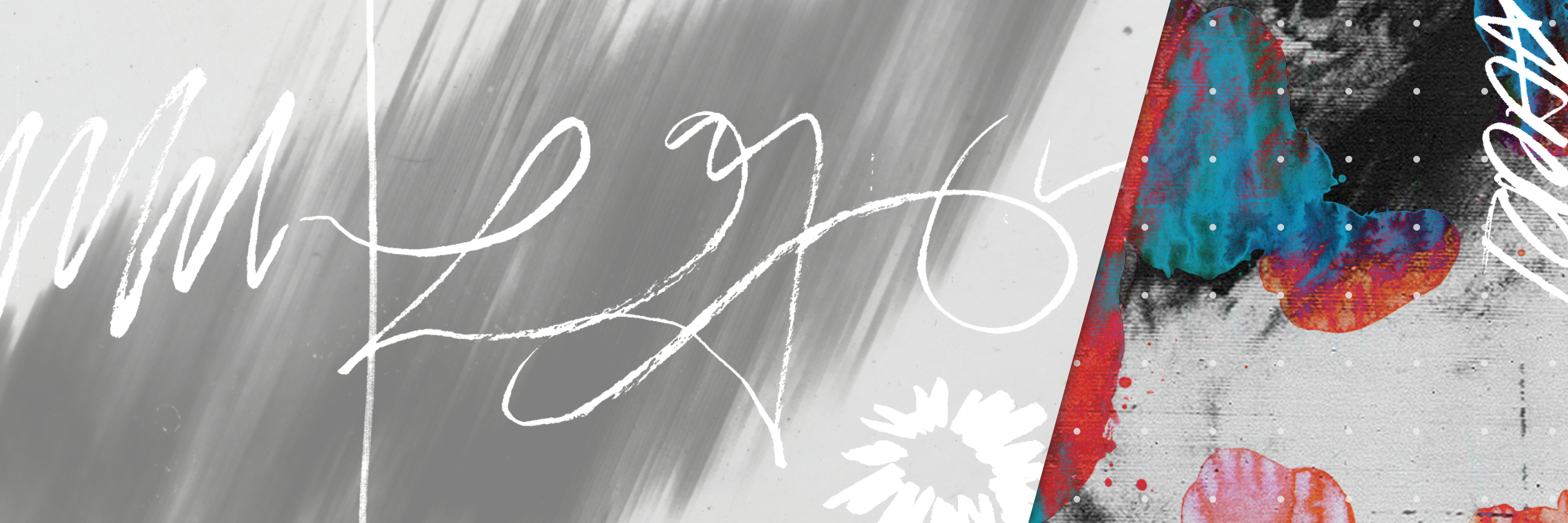
From the beginning, I really wanted to create something that began as an abstract sketch and gradually came to life with loads of colour.
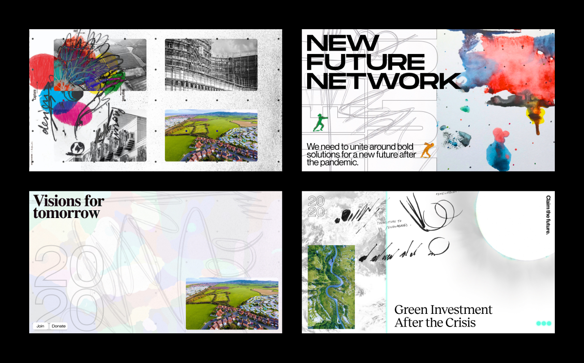
I commissioned our friend Ilyanna Kerr to create a series of illustrations for each of the policy areas. We wanted to keep these quite abstract and gestural, a means of visually categorising different papers and actions. This leaves room for people to imagine their own futures, rather than being too prescriptive.
I kept thinking about this quote from Muriel Cooper:
This stands as a sketch for the future.
Mikey had the idea to use a stellar corona as part of the identity. There’s something that I really love about this image in this context… it gives a sense of blank space, ellipsis or a pause, something to be filled.
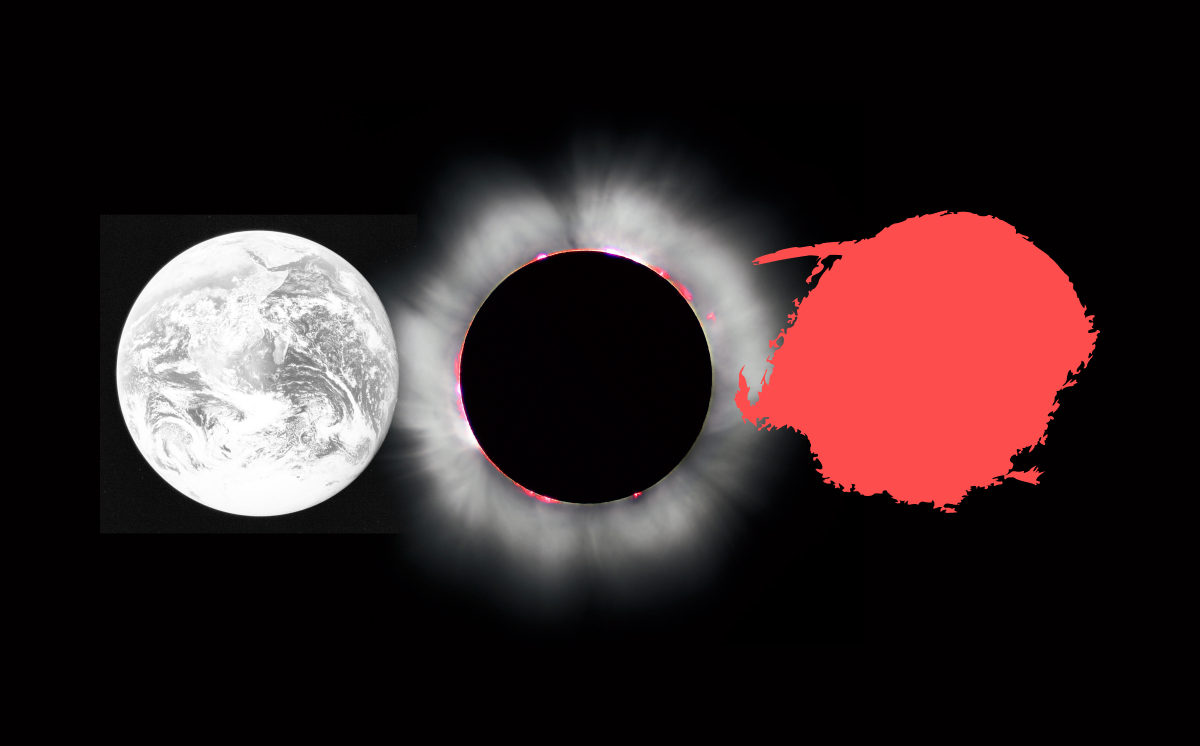
This got me looking at images of the earth from space, and aerial photos of empty cities during lockdown. I thought about Stuart Brand’s “Why haven’t we seen a photo of the whole earth yet?” campaign, and its impact on global consciousness and the environmental movement. I also read this essay from Ingrid Burrington around the same time, which offered an interesting counterpoint to this Californian idealism.
Meanwhile, older and slower-burn crises collide with these new ones. The so-called lungs of the planet continue to asphyxiate, carbon dioxide overwhelms oceans, and regulations on polluting technologies are relaxed more and more in the name of a free market. Capitalism’s invisible hand has terraformed the planet to better serve corporate personhood than actual life. There’s anxiety over not just access to fossil fuels, but access to the minerals needed for technologies that might help the world transition away from fossil fuels. We trade oil fields for lithium fields, for fantasies of moon mining. People fight even over the name and date of this era of crisis (Anthropocene or Capitalocene or Chthulucene), trying to turn planetary trauma into a fixed point in rock.
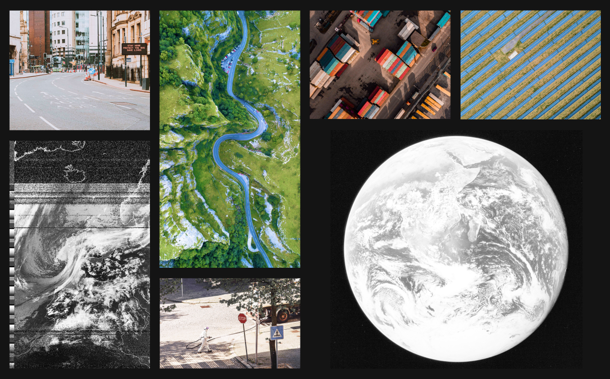
I thought it this was a useful tension in this, and that the macro view that aerial photos provide matched the scale and ambition of the project.
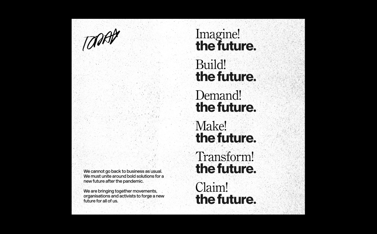
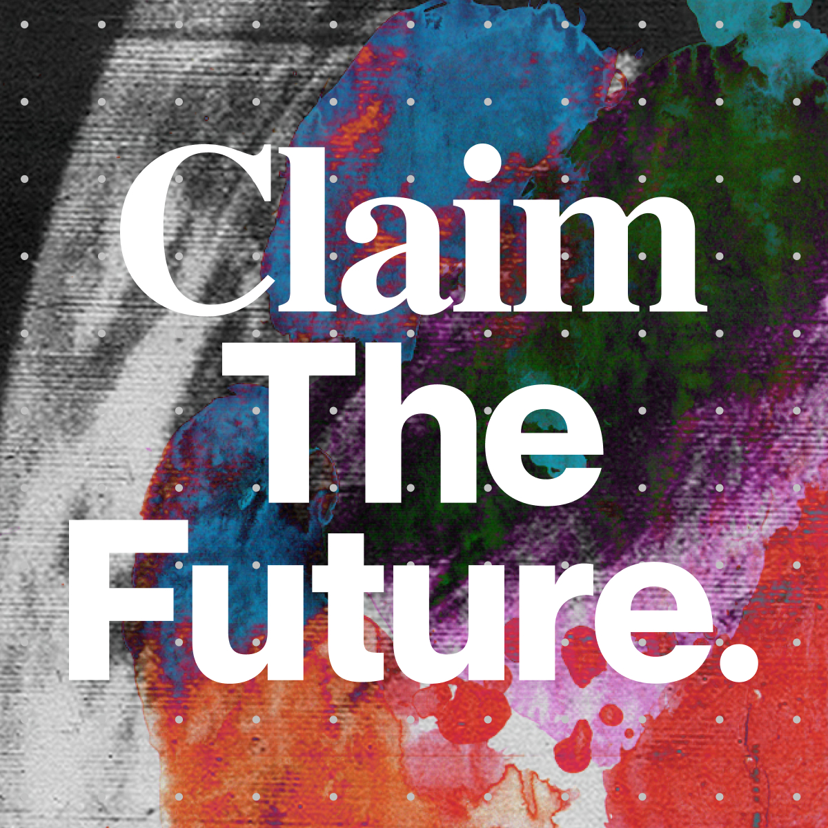
We didn’t really want to create a logo as such, and felt that the identity was much more powerful when Claim was replaced with different verbs as well.
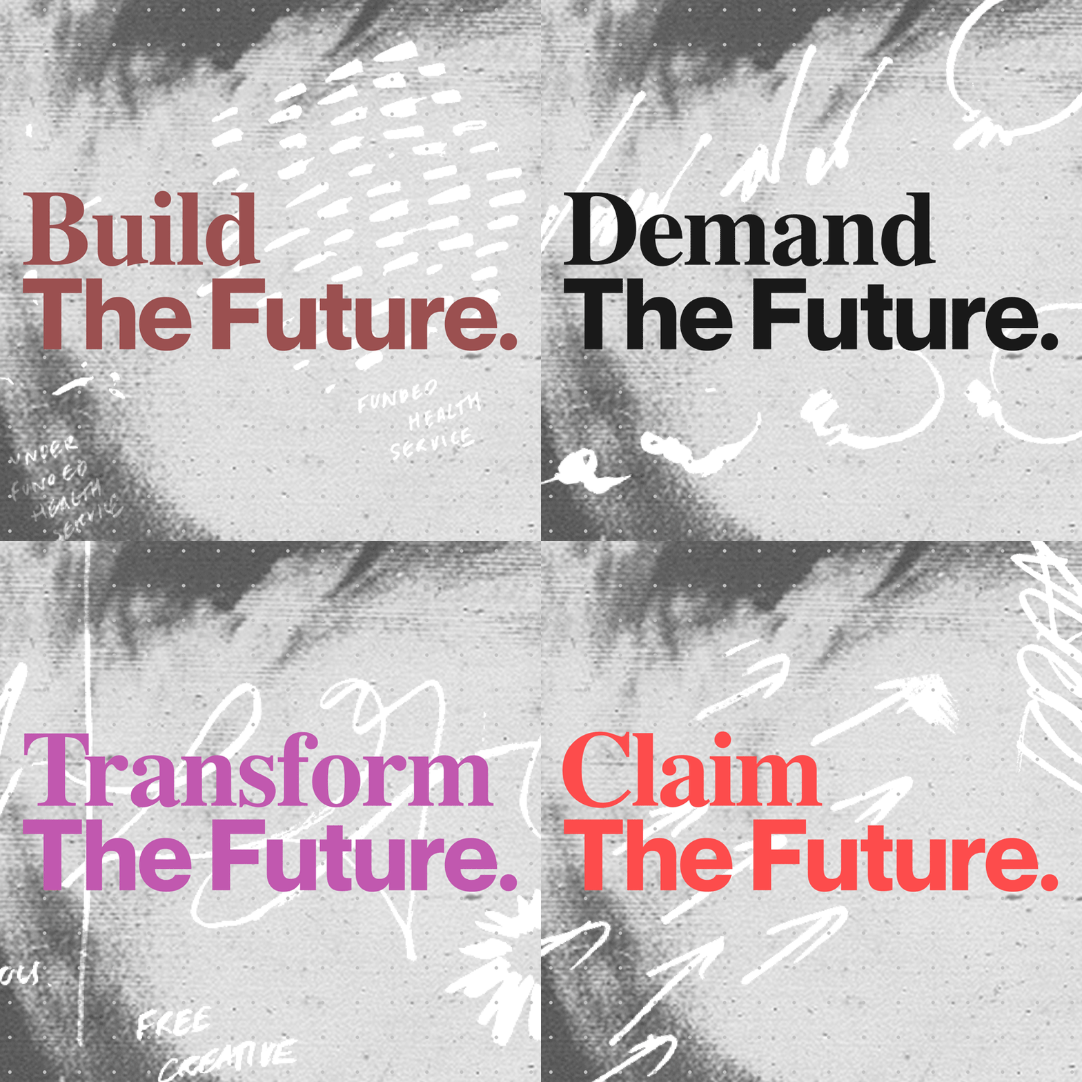
The dotted grid emerged as a consistent element tying lots of different pieces together, and alluded to architectural plans or pegboards. We played around with combining all these elements in layouts that gave a sense of breaking from the past or turning a page.
I’m pretty happy with the end result. It’s quite open and there are so many different elements to play with. We’ll hopefully be continuing this project in the future, so I’ll have a chance to develop it even further.
Join!
There are going to be loads of ways to get involved with this project over the next few months. I think it’s going to be really exciting.
You can join as an individual or organisation via the website.