— The Forest Multiple
The Smart Forests Atlas is a living archive and virtual field site exploring how digital technologies are transforming forests. It provides tools for researchers and other stakeholders to explore, analyse and reflect upon smart forest knowledges and technologies. The Atlas is designed to allow for multiple entrypoints into the research content. Visitors are encouraged to wander through the site according to their own interests, guided by the four wayfinding devices (Map, Radio, Stories and Logbooks).
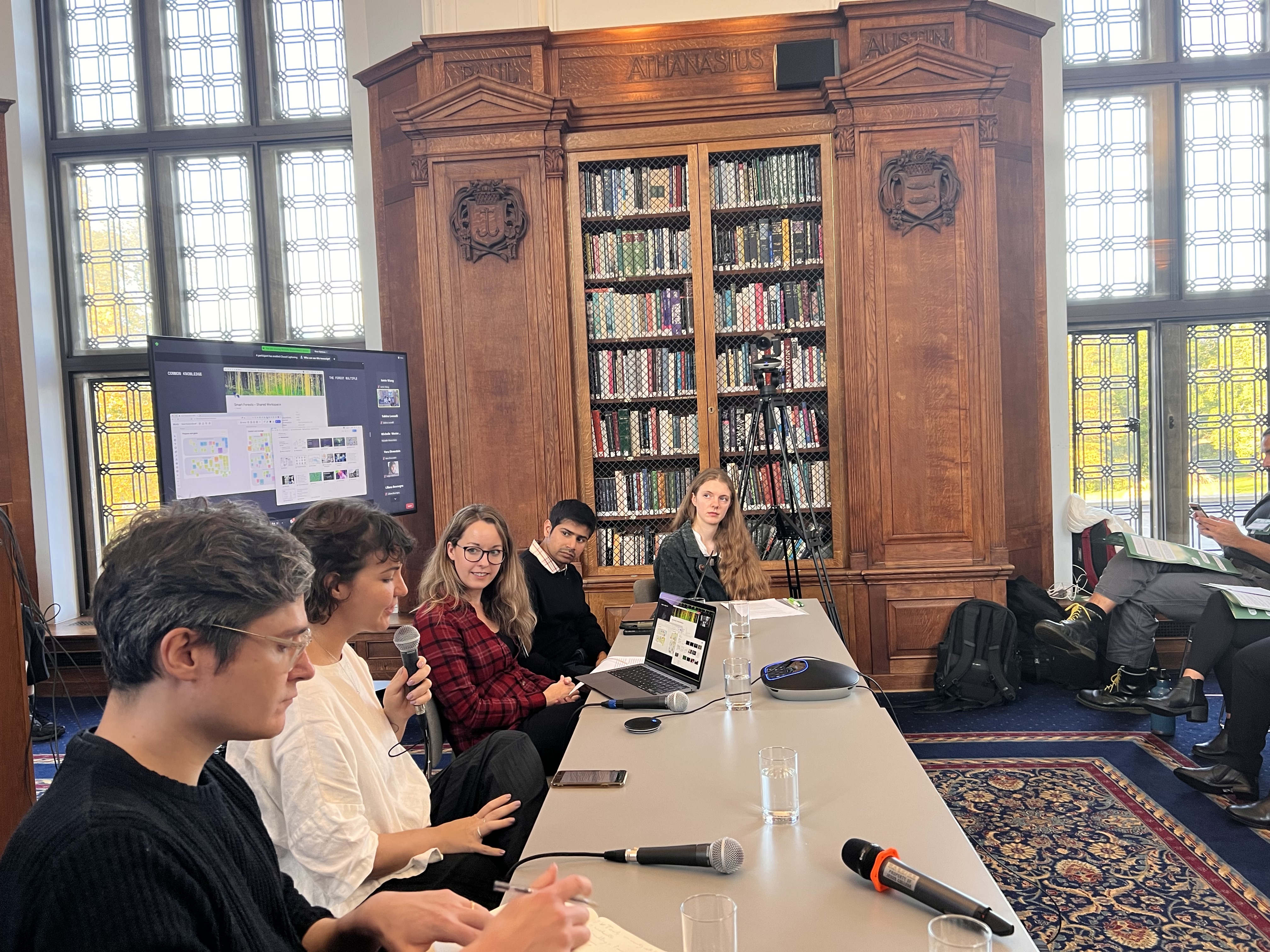
Alex and I had the pleasure of going to Cambridge to launch the Smart Forests Atlas at The Forest Multiple in October. We’ve been working on the Smart Forests Atlas for a good part of last year, so it was great to publicly launch it.
All of the other speakers were incredibly interesting, exploring topics like the complexity and limitations of carbon sequestering and the politics of sensing and monitoring. Some of the highlights included Lydia Gibson, Jenny Goldstein and Tone Walford. I really loved Andrea Botero Cabrera’s playful more-than-human derivé project which I felt brought everything back down to earth.
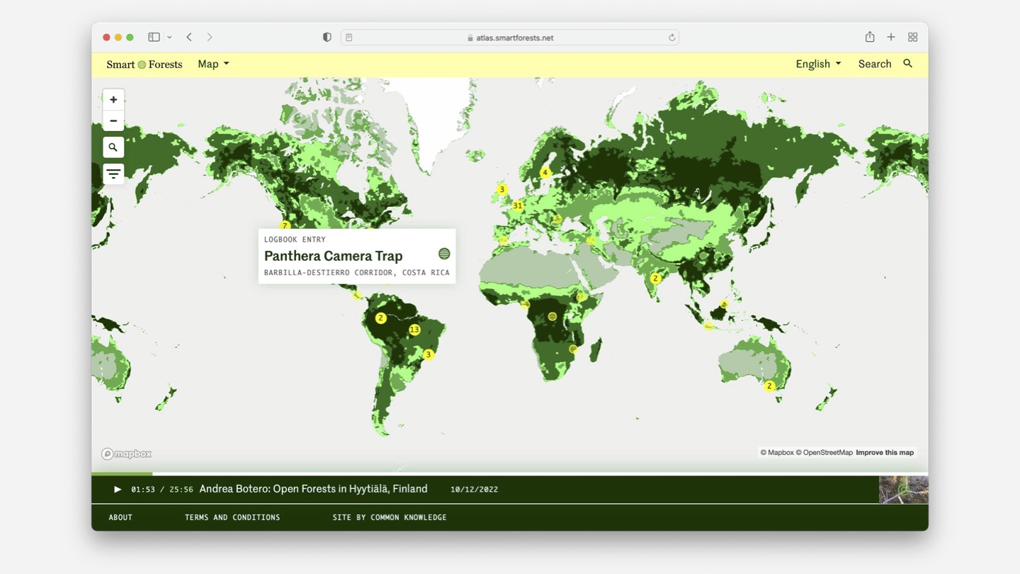
Many of our projects are centred around building tools that encourage localised political action. A lot of the time, this involves an element of mapping. In our experience, maps tend to be a powerful way of situating people, helping them find others in similar situations and, ultimately, giving them more agency.
We started working on the Smart Forests Atlas in early 2021, after working with Jennifer Gabrys / Planetary Praxis on the Airsift platform in 2020. What we liked about the Atlas was that it questioned and complicated the practice of mapping, particularly its colonial roots. When the Smart Forests team briefed us, they made sure to stress that they weren’t trying to present a neutral, top-down view of the world, but an entangled, situated, plural, participatory one – a “prismatic collection of mappings” to borrow Shannon Mattern’s words:
Ideally, we should balance or juxtapose different modes of knowledge and production: Western scientific and indigenous epistemologies, human and other-species ontologies, mechanical and organic means of experiencing and representing place, cartographic rationalism and empiricism, projection and retrospection. No single über-map can encompass all such subjectivities and sensibilities. Instead, we can aim for an atlas, a prismatic collection of mappings, that invites comparison and appreciation of the ways in which our world is both known and unknown.
The process of working on the Atlas stretched our thinking around designing digital experiences. Software development tends towards binary thinking and absolute truths, simplifying complex information so it can fit into a structured database or a set of user personas. In this project, we were asked to do the opposite of this: exploring multiplicity, complexity and more-than-human contributors.
I was frequently reminded of the Smart Forests Atlas while reading James Bridle’s wonderful new book Ways of Being. In the book, they suggest that “our machines should be non-binary, decentralized and unknowing”:
Unknowing, means acknowledging the limitations of what we can know at all, and treating with respect those aspects of the world which are beyond our ken, rather than seeking to ignore or erase them. To exist in a state of unknowing is not to give in to helplessness. Rather, it demands a kind of trust in ourselves and in the world to be able to function in a complex, ever-shifting landscape over which we do not, and cannot, have control.
This project was an opportunity to really explore this idea in practice. It was a fascinating and, at times, challenging, project to work on. (I think at one point we wrote user stories for a tree.) I’m really grateful to have had the opportunity to think about these questions so deeply.
Process
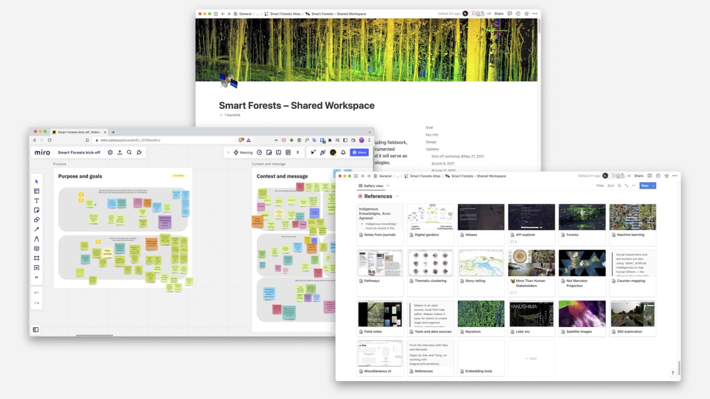
We started working on the design of the Atlas in parallel with the team developing the concept and starting their initial research. We began with a workshop with us and the Smart Forests team, where we explored their ideas around what the Atlas could be.
Our goal with the design was to strike a balance between usability and experimentation. We wanted to the Atlas to challenge conventional expectations about what a digital experience could be, but we also wanted to make sure that people could find their way around the site and access the content. We wanted the site to have its own voice, but without overpowering the contributors’ content and the diverse forms that this might take.
We started by mapping out the site, content taxonomy and modules. We went through several iterations of the design, moving from low fidelity wireframes to high fidelity visual designs. We met with the Smart Forests team a number of times to feedback on the designs and shape the direction of Atlas.
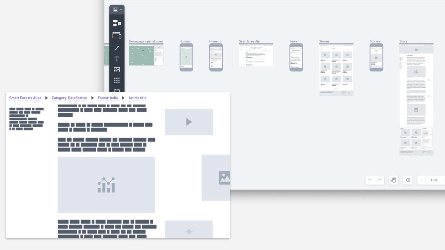
▲ An early sketch exploring how to offer clear navigational cues (at the top) and weave the main content with related multimedia.
The Atlas needed to be be flexible and accommodate a whole range of content, languages and contributors, weaving together local perspectives with external datasets and sensors. We chose to build open existing tools and data sources rather than building everything ourselves. This was partially a pragmatic decision and partially a way of connecting into existing digital ecosystems.
The digital (forest) garden
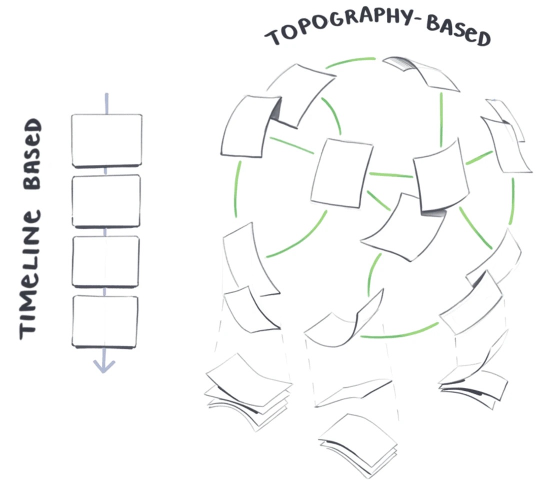
One key requirement was that the website needed to be able to evolve over time. This led us to the idea of digital gardens: websites that are exploratory, bottom-up, contextual and constantly evolving.
▲ Illustration by Maggie Appleton
Digital gardens require maintenance and invite participation: website as process rather than finished product. A digital garden is a constant work in progress, where the associations between different blocks of content matter more than when they were posted. Unlike a blog, which might be structured according to a strict content taxonomy or ordered chronologically, a digital garden is freeform and emergent.
Visitors are invited to explore the content and go on tangents according to their own interests. It’s expected for a digital garden to grow and change over time, with new information or perspectives added as the research process continues.
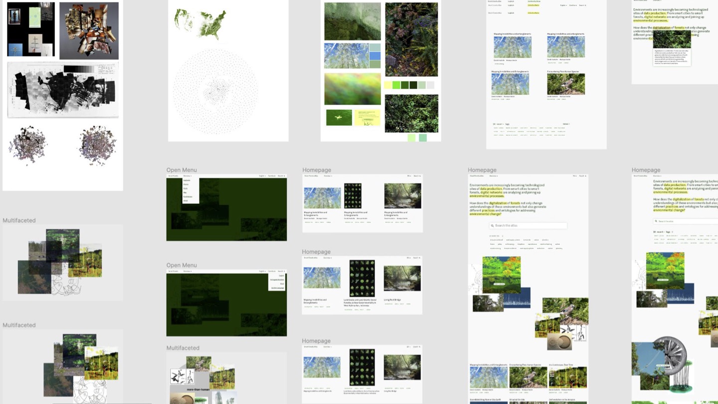
▲ Some early visual language sketches. I was looking for ways to visually show plurality – through always using multiple photos to communicate an idea, using a wide range of greens in the colour palette, using pixelated or blurred imagery and reversing expectations around foreground and background with the map.
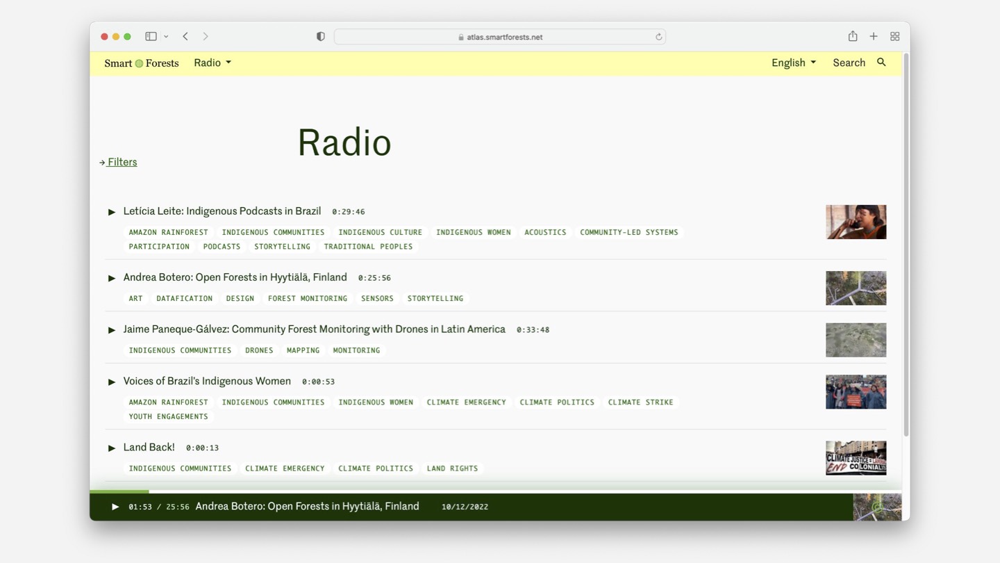
The Atlas is designed so that there are multiple entrypoints into the content. Visitors are encouraged to wander through the site according to their own interests, guided by the four wayfinding devices (Map, Radio, Stories, Logbooks).
The design of each wayfinding device is visually differentiated through icons, typography and content structure, while remaining densely interconnected through the tagging system.
Logbooks are intended to be a digital working space where people can collect up rough ideas as they develop over time. We designed this so that individual logbook entries could themselves be tagged and thus connected on a more granular level to other parts of the site.
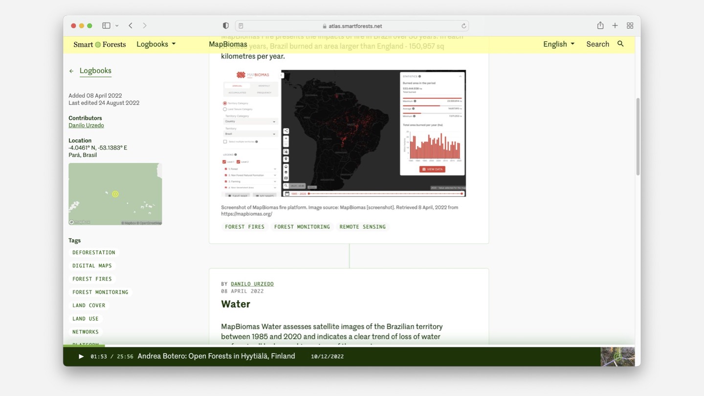
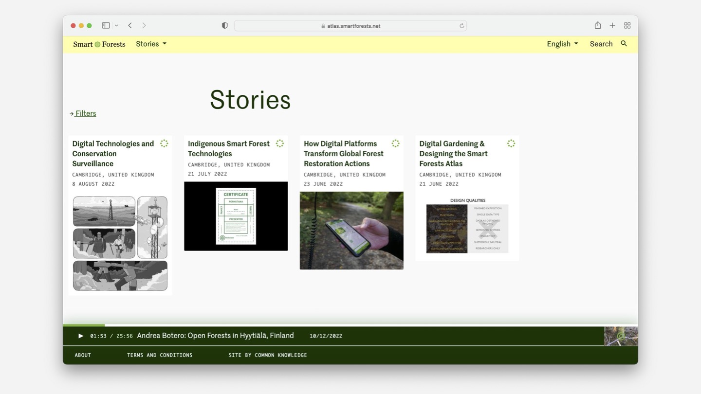
These are collected together and linked with each other, eventually feeding in to the Stories, which are more polished and in-depth.
The Map is designed to situate the Atlas’ content geographically – it reappears on the metadata column of Logbook and Stories pages.
The Radio is an ever present feature that can play while you browse the rest of the site.
Tagging system
The tag cloud, which features on the homepage and at the bottom of each Logbook and Story, is one of the core ways that people navigate the site. Clicking one of the tags here will open a side panel that surfaces related content within all four wayfinding devices, as well as the contributors who have used that tag.
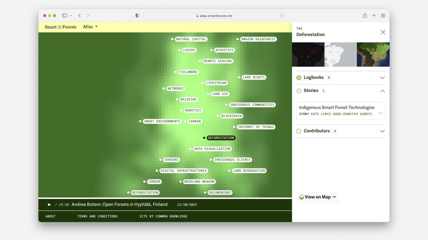
The tag cloud represents the Atlas in a visual and abstract way. It allows people to explore content intuitively rather than via a direct search, making space for emergent themes and unexpected connections. We chose tags as the means of relating content within the Atlas rather than a strict taxonomy of metadata. We wanted to remove any hierarchy between types of tags, allowing the content taxonomy to emerge from the bottom-up.
The technique we use to visualise the tags draws on graph theory and in particularly Eigenvector centrality. It surfaces the tags that are most frequently used and connected to other tags. In particular, it visualises the relationships between the pieces of content, even the unintentional ones.
Eigenvector centrality is most famously deployed in Google’s PageRank algorithm. The difference between this and something like PageRank is that PageRank is concerned with ranking pages on the basis of how many other pages link to them. Here we are ranking tags based on how other tags link to them.
When someone creates a new page that has tags, we perform a search of the page that it is linked to. We then look at the tags on the pages in that search, up to a fixed number of pages. This constructs a list of related tags.
For the related tags at the bottom of each page, we rank the list of related topics according to that degree of connectedness within the collection of topics that are related to that page. That is: how many times these particular topics are linked to each other throughout the site.
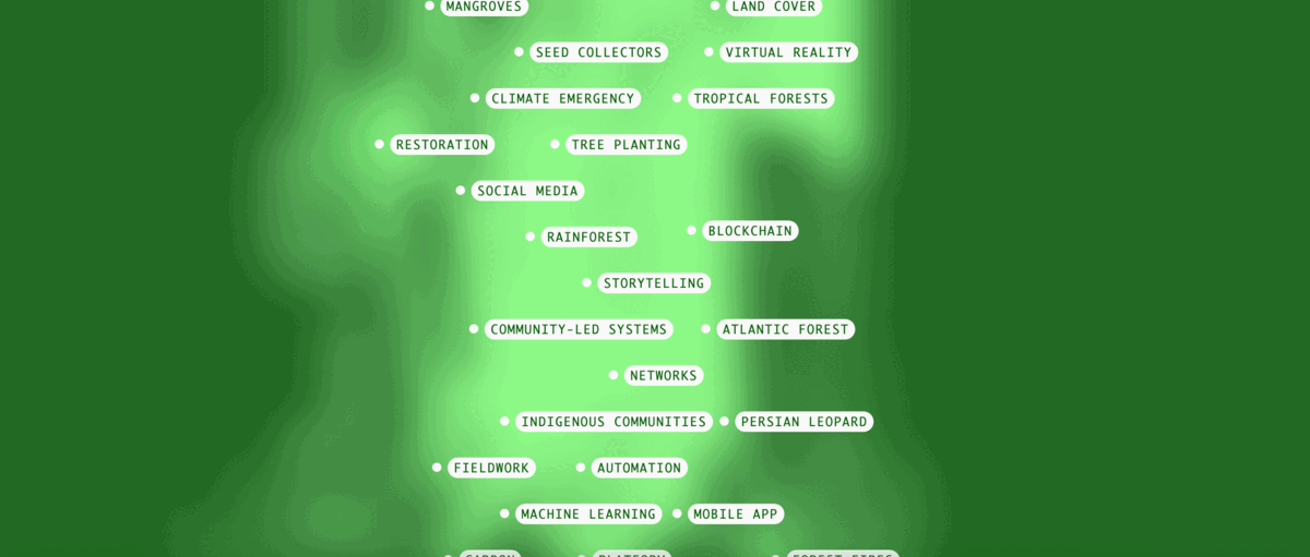
Initial versions of the homepage map were too visually dense to be useful or attractive. It wasn’t particularly useful, or even possible, to view the whole network of tags at once. So we limited the cloud to 30 tags, which we then randomise. This adds an elements of serendipity to the site – it’s different every time you visit. I also liked how this linked in to Shannon Mattern’s ideas at the beginning of this post: it’s not possible to view or understand the entire system from the top-down – you can only get snapshots from a particular viewpoint.
Contributions
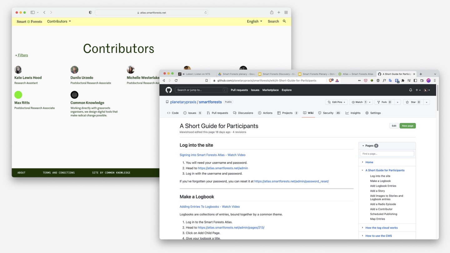
One of the important design considerations was how to invite participation from a range of contributors. We chose a CMS called Wagtail for its robust editor experience and granular editorial pipeline permissions. We wrote guidelines on how to the use the CMS, which is published on the wiki of Smart Forest’s public GitHub repository. From the outset, we set up localisation so that people would be able to post in their own languages in future. We also set up a public API of the website content to enable people to use and appropriate the research themselves.
In many ways, we’re just getting started with the Smart Forests Atlas. A website is never finished, even more so if it’s a digital garden. The team has added a lot content over the last few months and are onboarding more contributors now. We’re about to start a new phase of work, where we smooth over some of the rough edges and make improvements to the site as it is. Then we’ll work on some new features and improvements to how content is curated throughout.
Further reading:
- Visit the Atlas
- Read the Smart Forests research team’s paper on Digital Gardening with a Forest Atlas: Designing a Pluralistic and Participatory Open-Data Platform
- Read Maggie Appleton’s post on The History and Ethos of the Digital Garden