Some thoughts about making this website, written jointly by me and Piper Haywood (italics).
This website started as a conversation between Piper and myself. I had just left my full-time job and PH suggested that we could work together on a new website for my practice. It was also a good excuse for us to collaborate and explore some of our ideas about website design and development together.
I was interested in working with Gemma on pretty much anything! More specifically though, I wanted to work on a site that was less of an unchanging behemoth and more of a playground for learning, a permanent sandbox and ideas container. This is how treat my site, but I hadn’t had the chance to create something similar for and with someone else before.
From the outset, we set the intention that the process should be conversation between the two of us. We’re both interested in seeing design and development as a collaborative and iterative process, where both parties learn from the other. (Although, admittedly, I have learnt much more from PH during this process!)
You say that, but I’ve definitely learned a ton from you! Especially about letting ambiguity thrive, balancing it against structure.
Read more
This is one of the posts I wrote for the Core Languages blog last semester, as part of a course at Central Saint Martens that introduced graphic design students to the digital design mindset.
What is unique about digital design as a medium? How can we approach design for screens in a way that is natively digital, rather than an appropriation of print design?
In this essay, Cory Arcangel suggests that the term “web performance” is more appropriate for describing the digital medium than “web page”:
The term that really drives me up the wall, though, is web page. Page connotes something stable, unchanging, and definite. A book page exists. A book page is. A web page, on the other hand, is a vastly more complicated structure. It is a set of instructions blasted from a server farm across the globe through fiber-optic cables, then interpreted by a computer’s hypertext transfer protocol browser and displayed by a light-emitting-diode screen. All this, by the way, is happening in real time—reconstituted at each millisecond through a unique and contingent tangle of systems—and is supported by the constant churn of the power grid, itself (incredibly) still commonly powered by burning coal. So instead of web page, I’d prefer the term web performance, which would remind us that this information is both immediate and ephemeral. In a sense, it is thousands of coal-powered virtual Rube Goldberg machines — lined up from end to end — that power our Facebook Paper apps on our iPhones.
Read more
We’ve just launched a website for Claim The Future, a project led by John McDonnell. The full text of his speech at the launch on Wednesday gives a good overview of the project:
We must claim the future. We have to ask and answer the questions about what lives we want to live, what communities we want to live in and what future there should be for our planet. If we don’t others will. And it will be the establishment politicians and their corporate controllers that will answer these questions for us.

Both the identity and website were a joy to work on, so I thought I should document a little bit of the process before I forget about it.
Read more
Last semester I started teaching Digital as part of BA Graphic Communication Design at Central Saint Martins.
My class was part of the Core Languages course, which included other classes like Typography, Print and Production, and Photography. The idea behind this was to introduce second year students to foundational concepts and skills that could then feed into their wider graphic design practice and the longer term, research-based projects from their other classes.
Read more
I’ve just finished reading Design Justice by Sasha Costanza-Chock. This book really should be required reading for any designer working today.
It builds upon the work and principles of the Design Justice Network, defined as:
Design justice rethinks design processes, centers people who are normally marginalized by design, and uses collaborative, creative practices to address the deepest challenges our communities face.
Read more
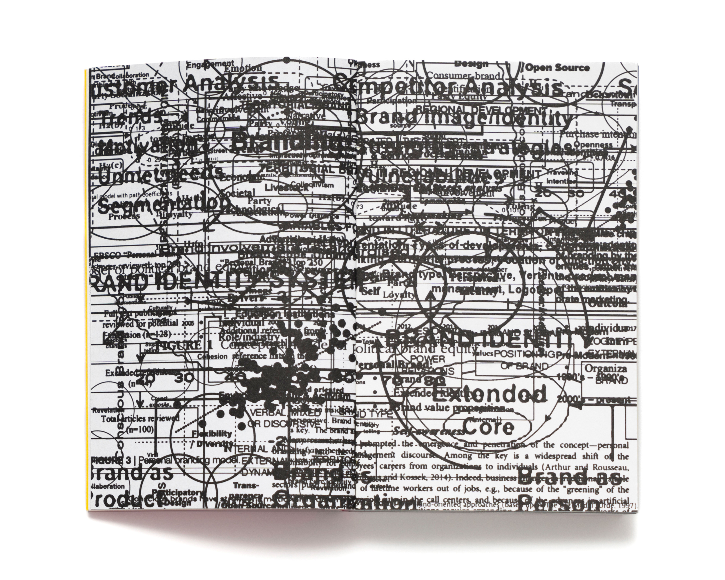
Very excited to read What is post-branding? How to Counter Fundamentalist Marketplace Semiotics, a book by Jason Grant & Oliver Vodeb published by Set Margins (which seems to be publishing all the good design books these days).
Post-Branding empowers better design of public communication for civic and activist groups by replacing corporate branding’s predatory principles with a new set of strategies embedded in a new culture of craft. A new way of being and knowing, for a new way of relating with the world.

Jason is runs the Brisbane-based studio Inkahoots. For the last 30 years or so they’ve worked in direct collaboration with social movements, transforming from a community-run screenprinting workshop into a non-hierarchical design studio focused on creative political expression.
Jason was one of my tutors at the Queensland College of Art. At the time I was in my final year at uni, about to graduate into a recession, and seriously questioning my choice to become a designer and design’s complicity in consumerism. Learning from him and about his practice had a huge influence on me. It prompted me to do a masters of Design Futures with Tony Fry and to try to find ways to be a designer outside of / against capitalism.
On a related note, I’ve been thinking about writing a series on design and design-adjacent practices that are modelling new ways of working. My shortlist so far is:
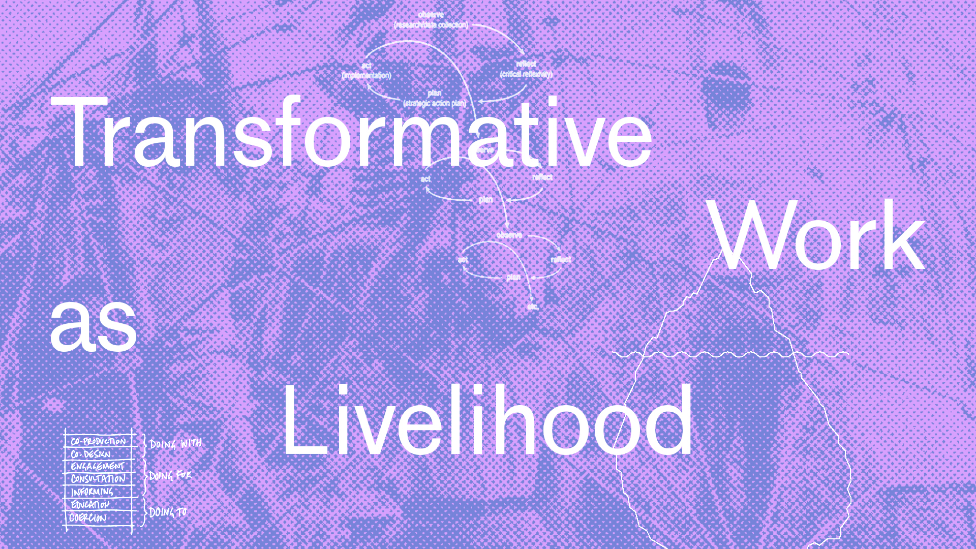
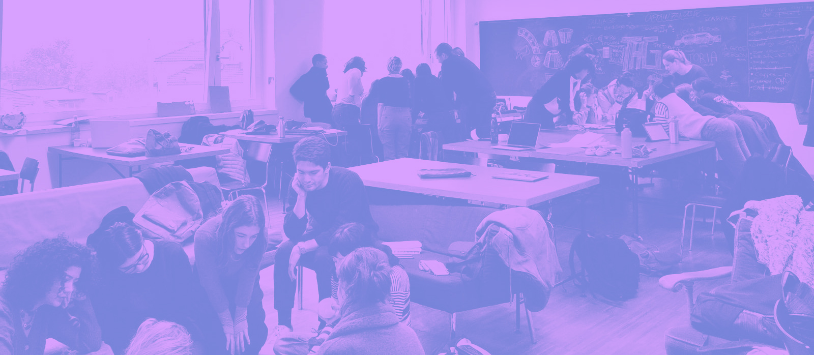
In December I went to the Free University of Bozen-Bolzano to teach a seminar on Transformative Work as Livelihood for the Eco-Social Design masters students. Over three days, we explored potential pathways available to socially and politically engaged designers, how to balance financial stability with meaningful work, and feminist strategies that ensure that transformative practices remain open to many and viable in the long-term.

Rather than focusing on strategies for individual success, we discussed and imagined new models for working together based on solidarity and care. To do this, we gathered a wide range of practices and tools that challenge the dominant narratives of design and work, exploring the multitude of alternative social and economic approaches that already exist in the here and now.
The seminar cycled between individual and collective exercises: brainstorming, reading, self-reflection and building a toolkit. My goal was to make the seminar really practical, full of useful tools that they could easily apply in their lives, and signposting them towards a broad range of further resources and readings that I’ve found useful in my practice. I wanted to be both critical of our current capitalist reality while also pointing to hopeful possibilities and new pathways. I’ve collected the slides and all the resources into this Arena channel.
I learned so much throughout this process. Below is an overview of what we did, my reflections on how it went and the changes I’d like to make if/when I run this seminar again. I’m documenting this (in probably too much depth) for my own benefit, but if it’s useful for others to read then that’s great too!

Read more
